Urban Fit
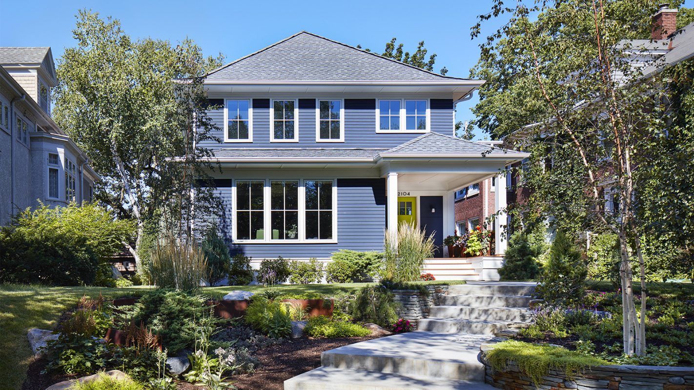
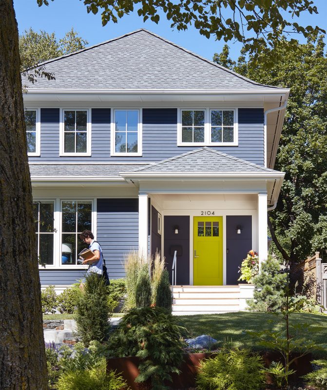
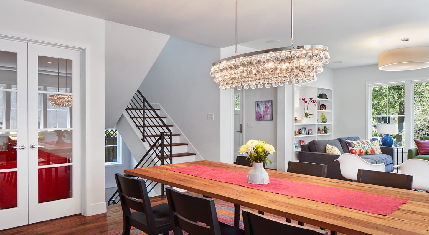
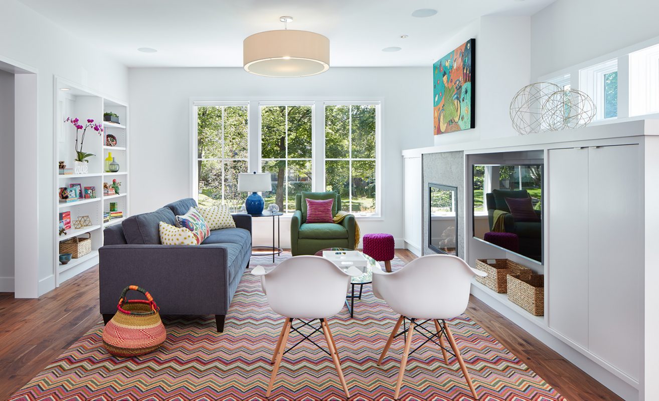
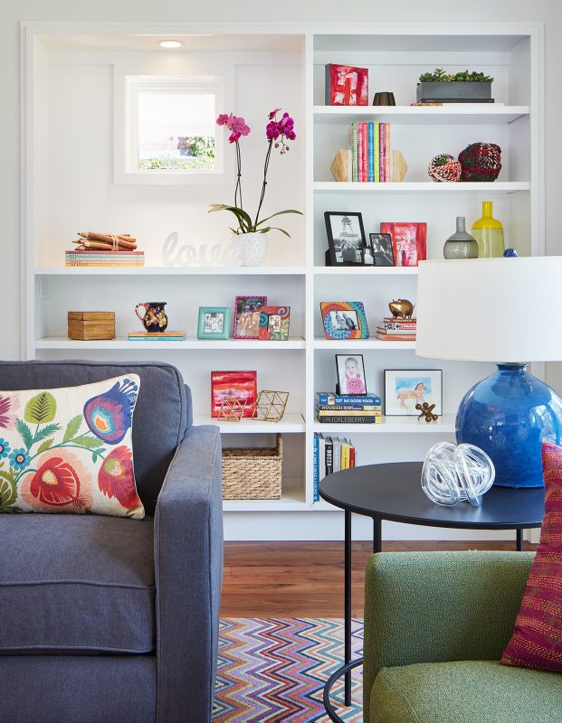
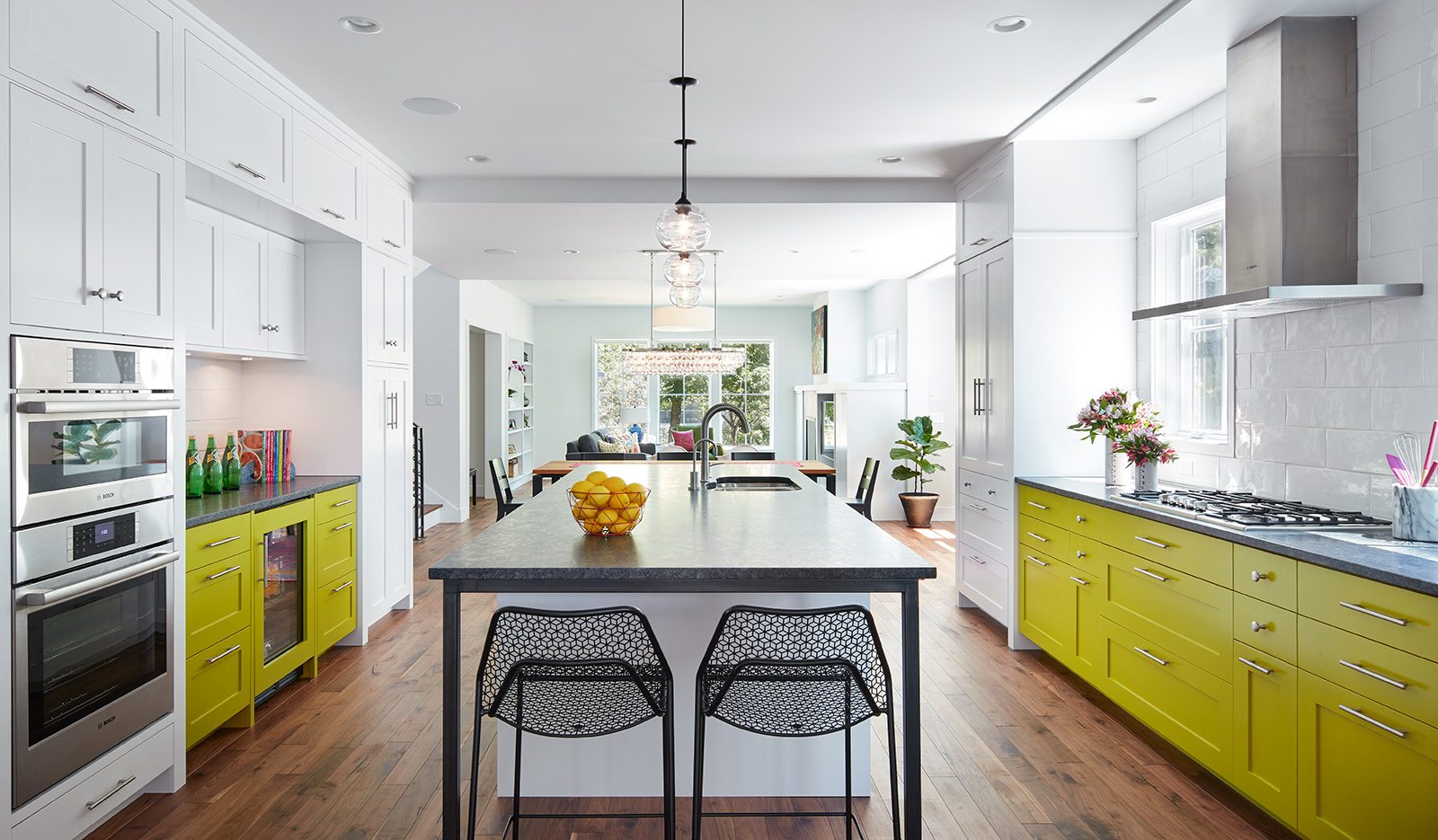
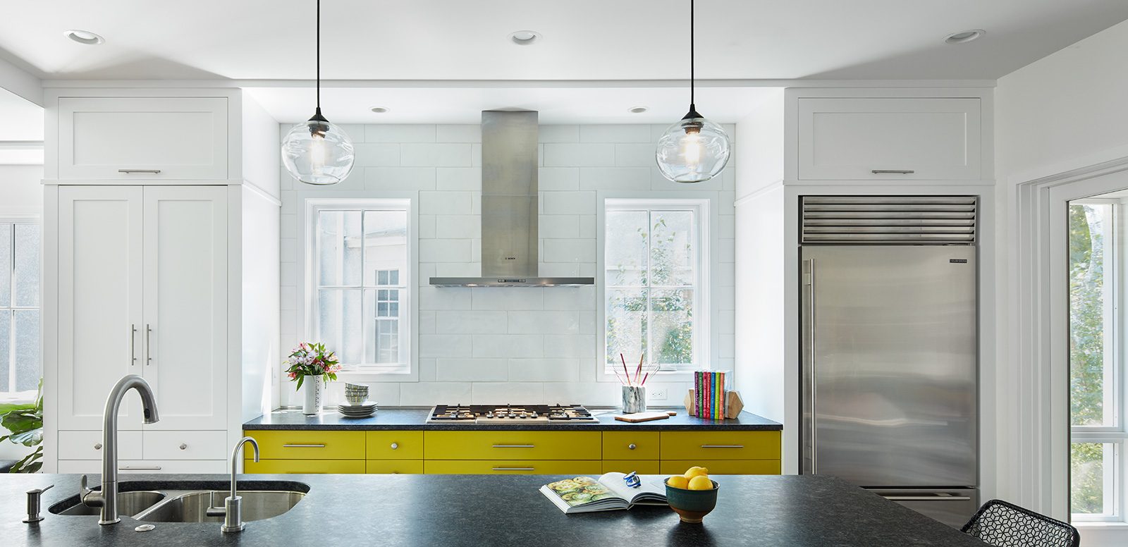
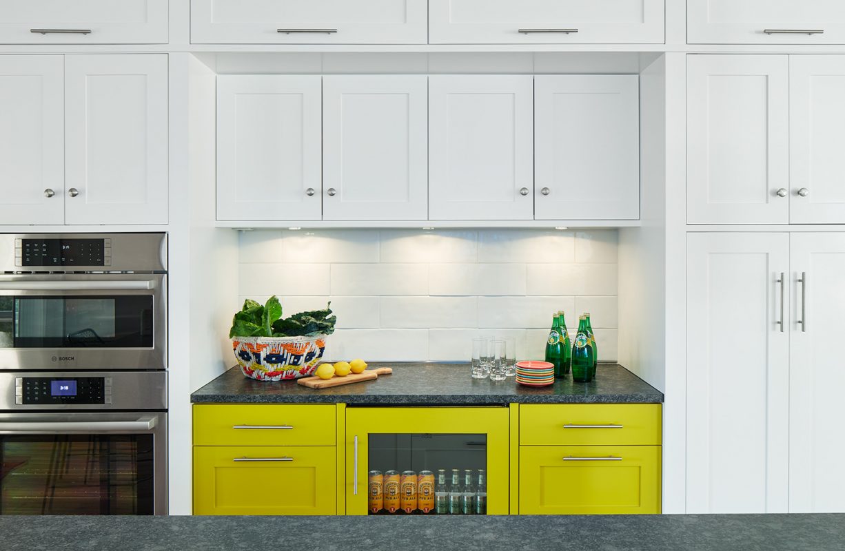
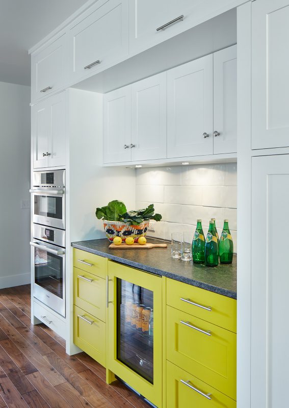
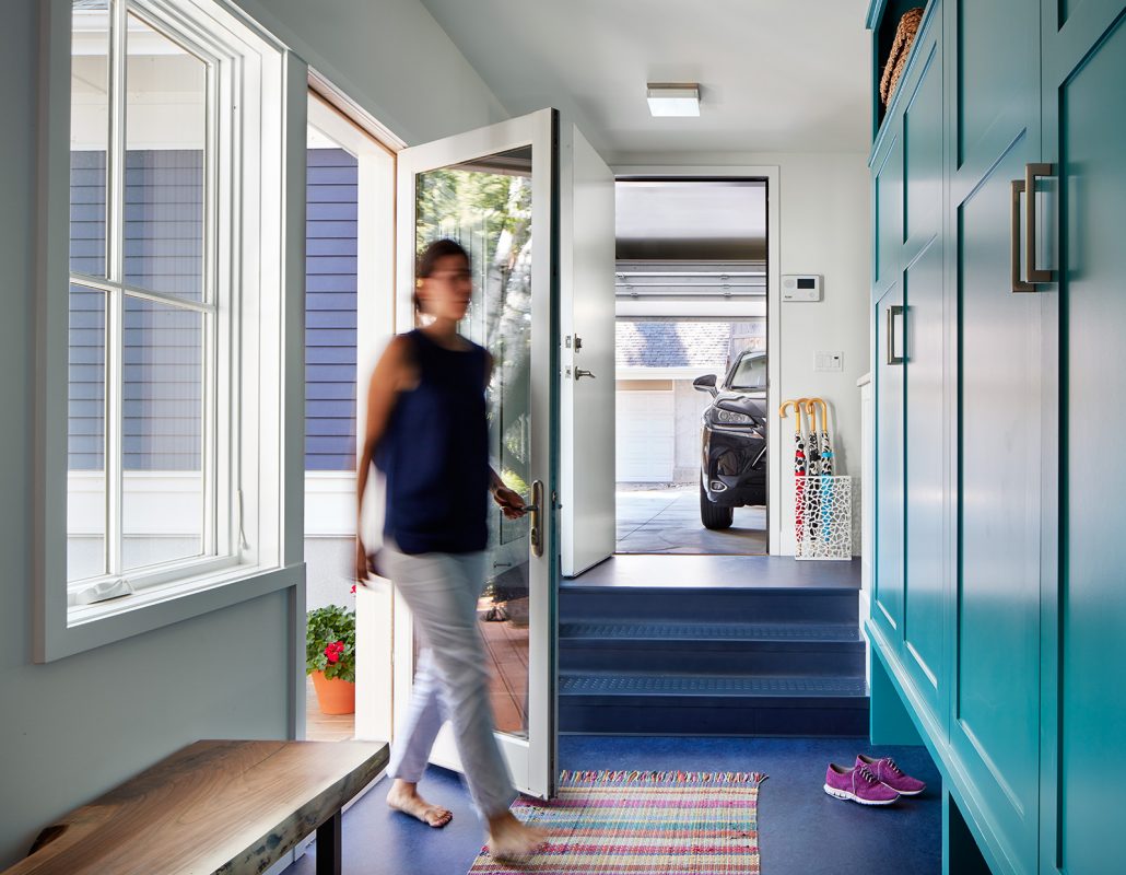
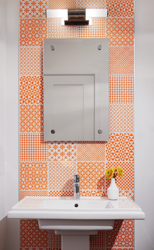
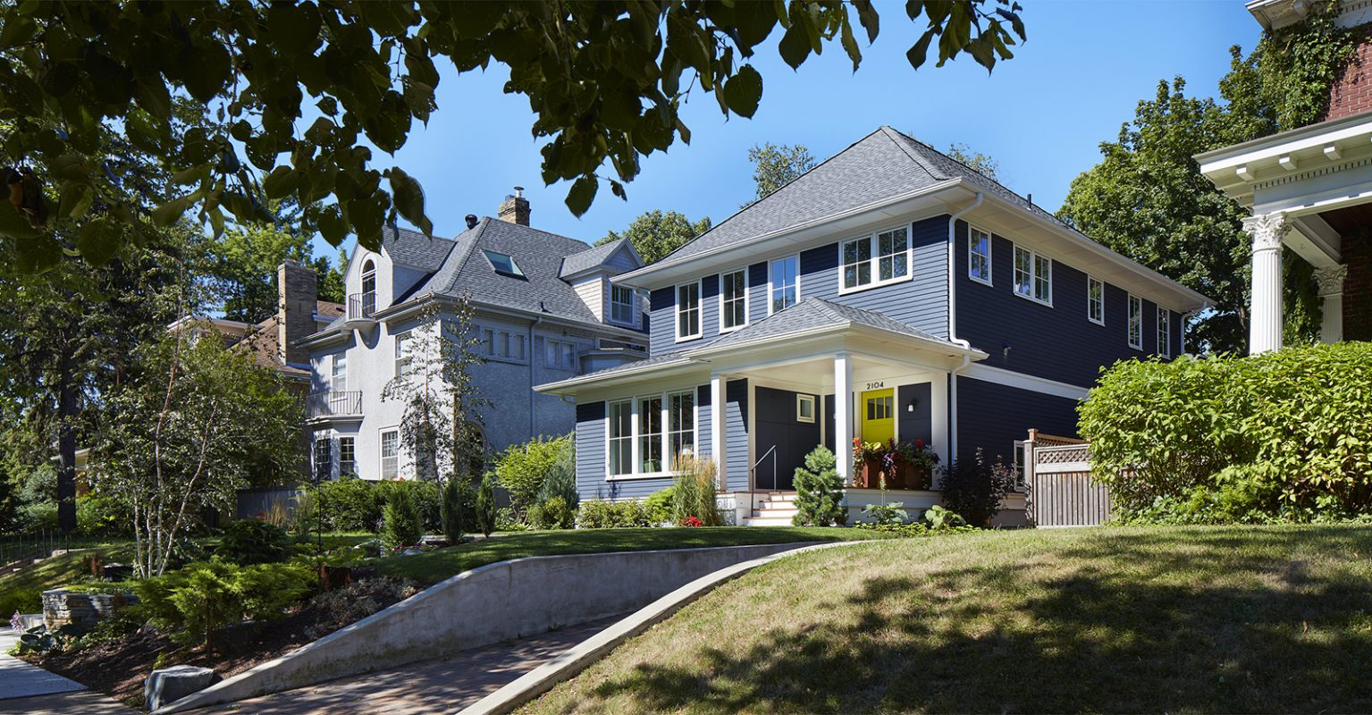
This new house was inspired by adjacent homes in the neighborhood – their simple forms, clapboard siding, kick at the edge of the roof line, and windows placed in a clean pattern. As a result, the house gracefully settles in on its established Minneapolis streetscape. That said, it isn’t just backward-looking – the large casement windows and paneled front entry porch are a nod to current times. Inside, a galley of living spaces set on the sunny south side of the lot connect front to back while the hardworking support spaces and stair are located on the north side of the lot. The clean, white palette and spare millwork are punctuated with pops of color in cabinetry, tile and furnishings. The recipe for this new house includes straight-forward pragmatism, respect for context, and a generous dash of colorful spark to top it off. Just what the homeowners ordered.

